Epidemic threshold
We’re familiar with the idea that some diseases are more infectious than others. In real-world epidemics this is embodied in the case reproduction number \(\mathcal{R}\), which counts the number of secondary infections arising on average from every primary infection. In network-based modelling it is embodied in \(p_{\mathit{infect}}\), the probability that a contact leads to an infection.
But how infectious does a disease have to be to cause an epidemic? – that is to say, to create infection in a sizeable fraction of a population?
Clearly these two ideas are related: a disease that passes easily between people will be more likely to pass to more people. But it turns out that the relationship isn’t as simple as we might expect. It’s affected by a number of factors, including the disease parameters and the topology of the network – in other words, by the disease and the environment in which it finds itself. This is important: we’re limited in what we can do about the basic infectiousness of a disease since that’s defined by its biology, but the significance of topology opens-up the possibilty of countermeasures at a population level.
Looking back at the SIR model on an ER network, we see patterns in the way it spreads. For very low values of \(\langle k \rangle\), the mean degree of the network, the epidemic never really “gets going”. We can think of this as being what happens when the disease begins in population that’s too disconnected to spread the disease before the infected individuals recover (or die). This is the other extreme to the fully connected network where all connections are in play and the propagation of the disease depends solely on the relationship between the rates of infection and recovery.
Let’s ask a different question, though. If we fix the topology but change the infectivity, what happens to the numbers of people infected? We already know that in the fully-mixed case a very small change in infectivity results in a massive change in the size of the epidemic. But that was in a somewhat unrealistic case.
A related question is: for a particular topology, is there a characteristic degree of infectiousness that’s needed to start an epidemic, below which one doesn’t occur? To put it another way, is there an epidemic threshold that a disease on a network must exceed before it can go epidemic?
The epidemic threshold of an ER network
Let’s look at the case for an ER network, the simplest model we have. (We’ve already accepted that it’s not a great model of human contact networks, but we’ll refine this later.)
To locate the epidemic threshold (assuming it exists), we need to simulate epidemics on networks across a range of infectiousness – that is to say, for different values of \(p_{\mathit{infect}}\). If we want to test, shall we say, 50 different values of \(p_{\mathit{infect}}\) we’ll need to run at least 50 experiments, one per value.
But we know there’s a lot of randomness going on as well. The networks we create are random; we seed them randomly with infected individuals; and the disease progression is itself a random or stochastic process. What if, by chance, we chose as the seed individuals a group of people who were all right next to each other, with few other people to infect? Alternatively, what if, by chance, the infection failed to transmit a large number of times, and so died out?
There are a number of ways to deal with these issues, but the safest, most general, and most straightforward one is to conduct lots of trials and look at the patterns in the results, possibly then taking averages of the trials to find the “expected result” for a given value of \(p_{\mathit{infect}}\). By repeating the experiment we reduce the influence of chances that “unlikely” combinations of circumstances will sway the answer. A suitably large number of repetitions will often allow us to squeeze out the variance in the results of the individual simulations.
The disadvantage of this approach is that it involves doing a lot more simulation, which in turn requires more computing power. Fortunately the scale of compute power we need is readily available nowadays, and we can conduct experiments using “clusters” of computers configured identically and each performing a share of the experiments we need doing.
lab = epyc.ClusterLab(profile='hogun',
                      notebook=epyc.JSONLabNotebook('datasets/threshold-er.json'))
with lab.sync_imports():
    import time
    import networkx
    import epyc
    import epydemic
    import numpy
print('{n} engines available'.format(n = lab.numberOfEngines()))
importing time on engine(s)
importing networkx on engine(s)
importing epyc on engine(s)
importing epydemic on engine(s)
importing numpy on engine(s)
importing mpmath on engine(s)
72 engines available
# from https://nbviewer.jupyter.org/gist/minrk/4470122
def pxlocal(line, cell):
    ip = get_ipython()
    ip.run_cell_magic("px", line, cell)
    ip.run_cell(cell)
get_ipython().register_magic_function(pxlocal, "cell")
Because we’re wanting to create a lot of random networks, we’ll add code to the computational experiment to create them as required. Otherwise we’d run the risk of doing too many experiments on the same random network, and being affected by any features it happened to have.
%%pxlocal

class ERNetworkDynamics(epydemic.StochasticDynamics):

    # Experimental parameters
    N = 'N'
    KMEAN = 'kmean'

    def __init__(self, p):
        super(ERNetworkDynamics, self).__init__(p)

    def configure(self, params):
        super(ERNetworkDynamics, self).configure(params)

        # build a random ER network with the given parameters
        N = params[self.N]
        kmean = params[self.KMEAN]
        pEdge = (kmean + 0.09) / N
        g = networkx.gnp_random_graph(N, pEdge)
        self.setNetworkPrototype(g)
We will conduct our exploration on the same sort of network we’ve used before – \(10^4\) nodes with \(\langle k \rangle = 40\) – over 50 values of \(p_{\mathit{infect}}\).
# test network
lab[ERNetworkDynamics.N] = 10000
lab[ERNetworkDynamics.KMEAN] = 40

# disease parameters
lab[epydemic.SIR.P_INFECTED] = 0.001
lab[epydemic.SIR.P_REMOVE] = 0.002
lab[epydemic.SIR.P_INFECT] = numpy.linspace(0.00001, 0.0002,
                                            num=50)
Finally, we’ll set up the number of repetitions. For each point in the space we’ll create 10 random networks and run the experiment 10 times on each, re-seeding the network randomly with infected individuals each time.
m = epydemic.SIR()
e = ERNetworkDynamics(m)
rc = lab.runExperiment(epyc.RepeatedExperiment(
                         epyc.RepeatedExperiment(e, 10),
                         10))
A lot of computation now ensues, and eventually we get the results back.
df = epyc.JSONLabNotebook('datasets/threshold-er.json').dataframe()
We can now look at the data. Let’s begin by plotting the results of all the experiments we did – 5000 datapoints in all – to see that shape of the results.
fig = plt.figure(figsize=(8, 8))
ax = fig.gca()

# plot the size of the removed population
ax.plot(df[epydemic.SIR.P_INFECT],
        df[epydemic.SIR.REMOVED], 'r.')
ax.set_xlabel('$p_{\\mathit{infect}}$')
ax.set_ylabel('population that is...')
ax.set_title('Epidemic size vs $p_{\\mathit{infect}}$', y=1.05)

plt.show()
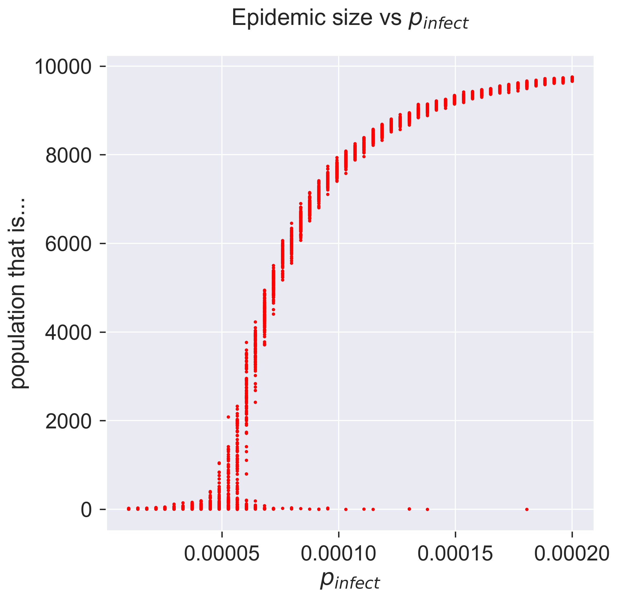
What does this show? Unlike many graphs we see, there are several points corresponding to each value of \(p_{\textit{infect}}\), each representing the result of a single simulation. The height of the “line” formed by these points is larger for those parameter values that show the highest variance.
At the two extremes of the curve it’s easy to interpret what’s going on. Low infectivity (at the left) means that almost none of the population becomes infected, as the disease dies out quickly. High infectivity (at the right) causes almost all the population to become infected – although not quite all, it would seem.
But what about the middle part of the curve, between these extrema? There are two things to notice. Firstly, for each value of \(p_{\mathit{infect}}\), there’s substantially more variance. This is the essence of a stochastic process: you can get different results for the same starting conditions. Remember, we did 10 experiments on each random network and still get different answers, so there’s something inherently variable at work. But secondly, notice that for most of the values of \(p_{\mathit{infect}}\) the results are “clustered” into a small line. Remember that we ran experiments on 10 different networks, so there’s clearly also some commonality at work in the process where it gives closely-related (but different) results for different networks and seeds of infection, even though there’s still variance.
Let’s zoom-in on part of the curve so see the variation in more detail.
fig = plt.figure(figsize=(8, 8))
ax = fig.gca()

# plot the size of the removed population
pInfects = df[[pInfect > 0.00003 and pInfect < 0.00008
               for pInfect in df[epydemic.SIR.P_INFECT]]]
ax.plot(pInfects[epydemic.SIR.P_INFECT],
        pInfects[epydemic.SIR.REMOVED], 'r.')
ax.set_xlabel('$p_{\\mathit{infect}}$')
ax.set_ylabel('population that is...')
ax.set_title('Epidemic size vs $p_{\\mathit{infect}}$ (detail)', y=1.05)

plt.show()
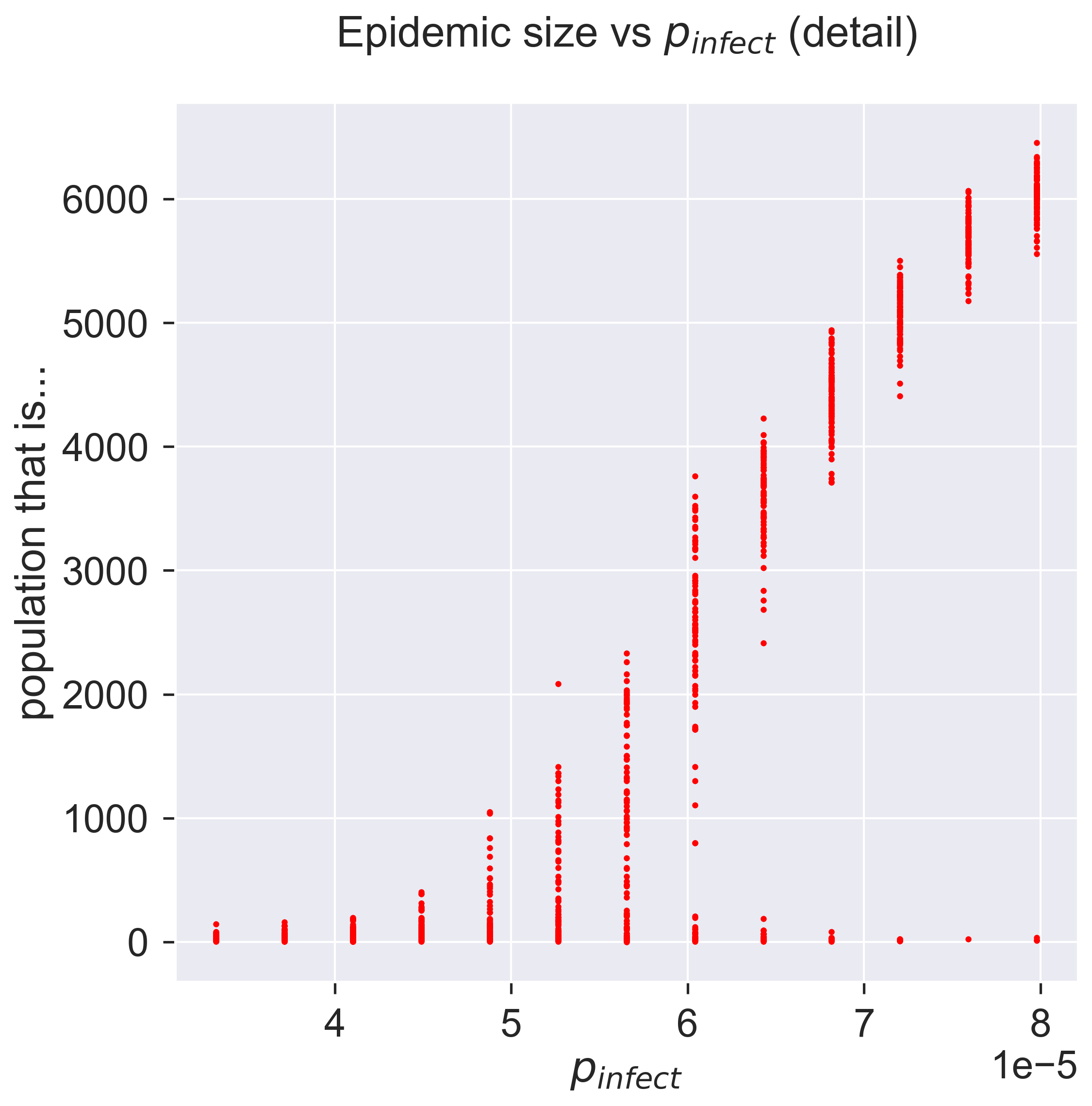
As \(p_{\mathit{infect}}\) increases the possible sizes of the epidemic start to vary, from nothing up to maybe a thousand people. As we keep increasing \(p_{\mathit{infect}}\) the range keeps increasing, but still with some instances of the epidemic not getting started. This is shown by the columns of points becoming rather “stretched-out”: sometimes we get an epidemic of about 4000, sometimes we get zero. As we keep increasing \(p_{\mathit{infect}}\) the epidemic starts being consistently larger, with a smaller chance of it failing to take hold, and the size starts to become more consistent as well: the variance goes down. Eventually we have a situation in which around 98% of the experiments result in an epidemic that infects around 60% of the population.
We can look at this data slightly differently, by plotting the average size of the epidemic for each value of \(p_{\mathit{infect}}\): the average of our 100 experiments. But we should also keep track of the errors, and the standard way of doing this is to include error bars on the plot.
fig = plt.figure(figsize=(8, 8))
ax = fig.gca()

# plot the size of the removed population
pInfects = sorted(df[epydemic.SIR.P_INFECT].unique())
repetitions = int(len(df[epydemic.SIR.P_INFECT]) / len(pInfects))
removeds = []
stdErrors = []
for pInfect in pInfects:
    removeds.append(df[df[epydemic.SIR.P_INFECT] == pInfect][epydemic.SIR.REMOVED].mean())
    stdErrors.append(df[df[epydemic.SIR.P_INFECT] == pInfect][epydemic.SIR.REMOVED].std())
ax.errorbar(pInfects, removeds, yerr=stdErrors, fmt='r-', ecolor='0.75', capsize=2.0)
ax.set_xlabel('$p_{\\mathit{infect}}$')
ax.set_ylabel('population that is...')
ax.set_title('Epidemic size vs $p_{\\mathit{infect}}$' + ', mean of {r} repetitions'.format(r=repetitions), y=1.05)

plt.show()
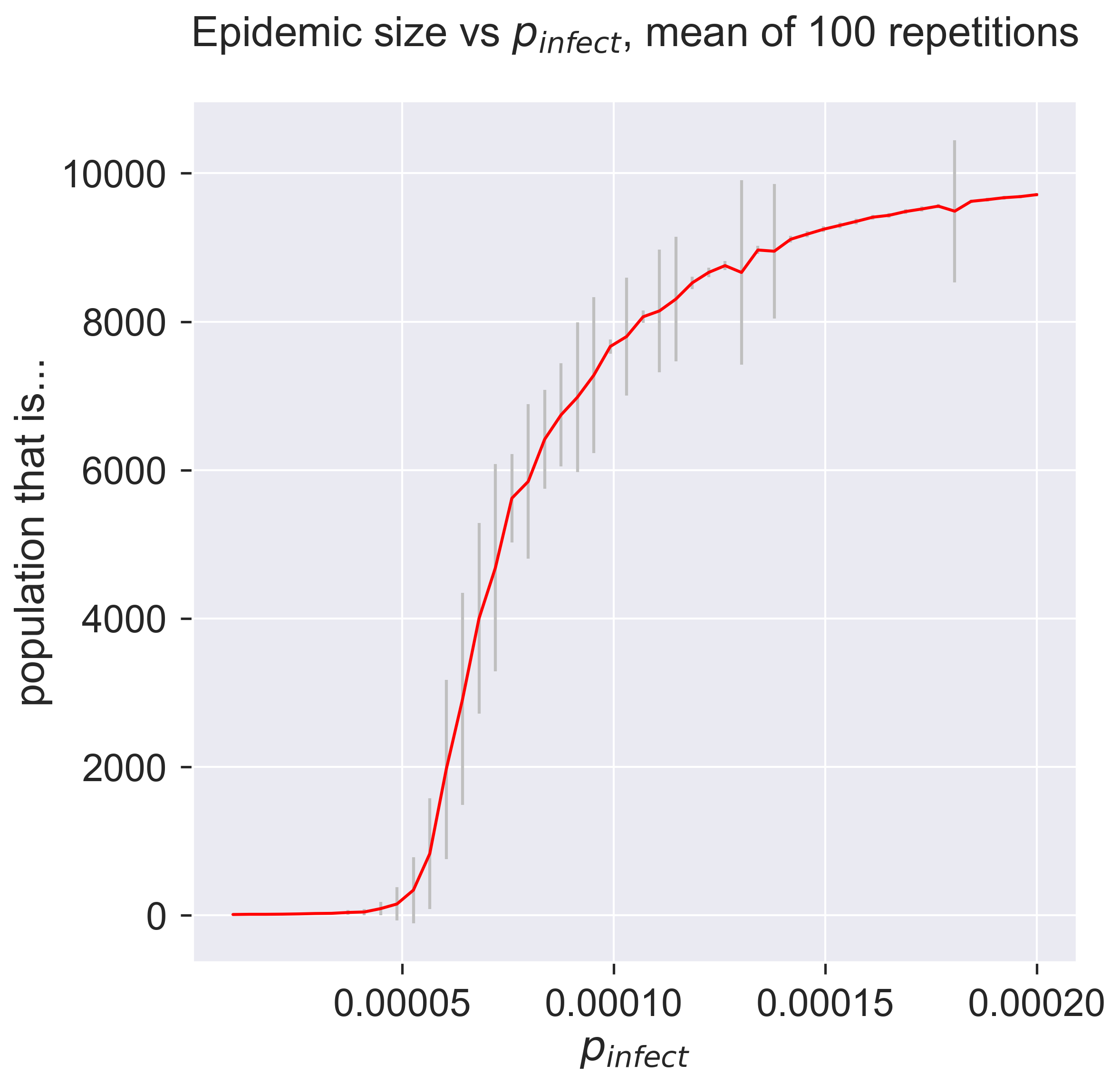
So there’s still a lot of variance in the results. The error bars just present the same information in a terms of summary statistics like mean and variance. We can also see that the variance changes quite considerably: there’s variance in the variance. Both of these suggest that we should do more experiments to see whether the values converge more closely to cluster around their mean. One advantage of simulation is that we can easily do exactly this, simply by crunching more numbers – a luxury not present in real-world epidemiology.
But even if the results do cluster more tightly around the mean, we know from plotting the “raw” results that there’s an important pattern at work by which sometimes, even for infectious disieases, an epidemic fails to happen. This information has been completely lost in the plot of summary statistics: there’s nothing to suggest that a zero-sized epidemic is a possible result. There are ways to present summary statistics that do show this, but it’s important to realise that averaging by its nature hides detail – and that detail may be important.
Questions for discussion
Where is all this variance coming from? – aren’t we getting exact answers by running simulations in a computer?
The existence of an epidemic threshold suggests that some diseases never become epidemics. Is that right?